
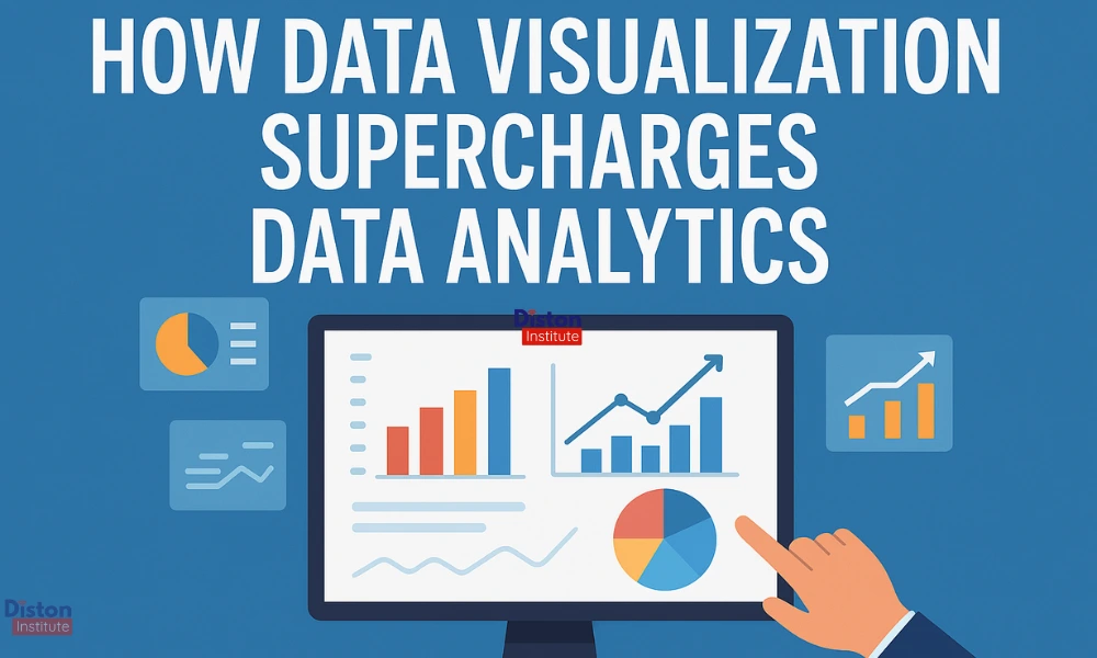
Organisations are creating enormous amounts of data every second in today’s data-driven world. But without being converted into insights that decision-makers can comprehend and act upon, raw data—no matter how vast—has no value. This is where the field of data analytics is revolutionised by data visualisation.
Data visualization helps to find patterns, trends, and hidden insights that would otherwise be lost in spreadsheets by turning complicated datasets into understandable, interactive visuals. A dynamic dashboard, an interactive heat map, or a vibrant bar chart—data visualization can boost analytics and help make better business decisions.
Data visualization is just one part of the powerful world of Data Analytics. If you’re curious about mastering the full skill set, check out Diston Institute’s Data Analytics course designed for beginners and career changers.
Table of Contents
What is Data Visualization
Data visualization is the process of representing information graphically using tools like maps, graphs, and charts. Its goal is straightforward: to simplify the interpretation, analysis, and understanding of data.
A well-designed visualization allows users to quickly understand the meaning behind the numbers rather than having to sift through endless rows and columns in Excel. By removing misunderstandings and confusion, this not only saves time but also increases decision-making accuracy.
Why Data Visualization is Vital in Data Analytics
Data analytics is all about discovering insights from data. However, traditional analysis techniques might not be sufficient when datasets get too big or complicated. Data visualization enhances data analytics in the following ways:
1. Transforms Complexity into Clarity
Thousands or millions of records are frequently found in large datasets. This complexity is reduced through visualisation, which transforms intimidating numbers into understandable, succinct images.
2. Reveals Patterns and Trends
It can be challenging to find correlations, trends, and anomalies in raw data format, but visualization tools can help. For instance, a line graph is far more effective than a table at displaying sales growth over time.
3. Improves Decision-Making Speed
Time is of the essence in business. Data visualisation helps decision-makers act more quickly by providing quick, at-a-glance insights, which speeds up the analysis process.
4. Enhances Communication
Everyone in the company can access data thanks to a well-structured dashboard or report that can convey findings to both technical and non-technical stakeholders.
5. Supports Predictive Analytics
Better forecasting and strategic planning are made possible by analysts using visualization to compare trends in historical data with current performance.
Real-World Applications of Data Visualization in Analytics
Data visualization is a cross-industry requirement and is not exclusive to any one sector. Here are a few instances:
- Business & Marketing Analytics: Monitor sales funnels, ad campaign performance, and customer engagement.
- Healthcare Analytics: Keep an eye on outbreak trends, hospital performance, and patient data.
- Finance & Banking: Analyze stock trends, spot fraud patterns, and improve portfolio performance.
- Education: Analyze curriculum efficacy, monitor attendance, and assess student performance.
- Government & Public Sector: Display public health reports, budgetary allocations, and census data.
Data Visualization Tools
The tools utilised have a major impact on the power of data visualisation. In 2025, the following are some of the most widely used data visualisation tools:
1. Tableau
Tableau, one of the most widely used tools in the analytics sector, provides real-time data analysis, interactive dashboards, and smooth integration with numerous data sources. Both novices and experts will find its drag-and-drop interface easy to use.
Key Features:
- Data blending from multiple sources
- Predictive analytics
- Automated reporting
2. Power BI
Developed by Microsoft, Power BI is known for its affordability, ease of integration with Excel, and strong reporting capabilities. For businesses wishing to generate dynamic reports without significant learning curves, it’s perfect.
Key Features:
- Integration with Microsoft tools
- Customizable dashboards
- Mobile app accessibility
3. Google Data Studio
It is a free cloud-based visualization tool from Google that lets users create interactive reports from data from Sheets, Ads, and Analytics.
Key Features:
- Real-time data updates
- Team collaboration
- Easy sharing with links
4. Qlik Sense
Developed by Microsoft, Power BI is known for its affordability, ease of integration with Excel, and strong reporting capabilities. For businesses wishing to generate dynamic reports without significant learning curves, it’s perfect.
Key Features:
- Associative data model
- Self-service visualization
- Augmented analytics
5. D3.js
D3.js (Data-Driven Documents) offers unparalleled flexibility for coding professionals to create unique, interactive data visualizations on the web.
Key Features:
- Full customization
- Works directly with HTML, SVG, and CSS
- Open-source and free
6. Zoho Analytics
AI-powered insights and a large selection of pre-made visualization templates are features of this cloud-based BI and analytics tool.
Key Features:
- Data blending from multiple sources
- Predictive analytics
- Automated reporting
7. Looker
Looker, which is now a component of Google Cloud, enables sophisticated data modelling and embedded analytics for big businesses.
Key Features:
- Modern BI platform
- Embedded dashboards
- Integration with Google BigQuery
Best Practices for Effective Data Visualization
Even with strong tools, users can be mislead or confused by poor designed visualizations. The following are recommended practices to adhere to:
- Know Your Audience: Adapt the images to the technical knowledge of your audience.
- Choose the Right Chart: Heat maps for density, line charts for trends, and bar charts for comparison.
- Keep It Simple: Avoid clutter focus only on essential data.
- Use Colors Wisely: Instead of overpowering the viewer, colors should direct their attention.
- Ensure Data Accuracy: Prior to producing visuals, always confirm your source.
The Future of Data Visualization in Analytics
Data visualisation will get even more predictive and immersive with developments in AI, AR/VR, and real-time analytics. We’re heading towards automated insight generation, in which machines can identify irregularities, produce visual justifications, and suggest actions without the need for human involvement.
Conclusion
Data visualisation has become indispensable in the big data era. It speeds up decision-making, reveals insights that propel business growth, and transforms raw data into meaningful stories. Organizations can genuinely boost their data analytics capabilities by utilizing contemporary visualization tools like Tableau, Power BI, and Google Data Studio.
FAQ’s About Data Visualization
1. Purpose of data visualization in analytics?
To condense complicated data into understandable images in order to gain insights more quickly.
2. Which Type of Industries are using data visualization?
Government, business, finance, healthcare, marketing, and education.
3. Top Data Visualization tools in 2025?
Tableau, Power BI, Google Data Studio, Qlik Sense, Looker, Zoho Analytics, D3.js.
4. How does Data Visualization help decision-making?
Accelerates comprehension, identifies patterns, and permits data-driven decision-making.
5. Is coding needed in Data Visualization?
Not for the majority of tools, coding is necessary for some more complex ones, such as D3.js.