

Typography surrounds us—appearing on storefronts, websites, packaging, books, and advertisements. It shapes how we see brands, guides our reading, and even evokes feelings. Yet many overlook how much work goes into choosing the right fonts and arranging text. Whether in print or on screen, typography design significantly influences how messages are delivered and interpreted. Whether you’re a designer, a business owner, or just curious, learning typography can make your work stand out. In this guide, we explore the fundamentals, history, principles, and practical impact of typography in design.
Understanding the Fundamentals of Typography
What Is Typography?
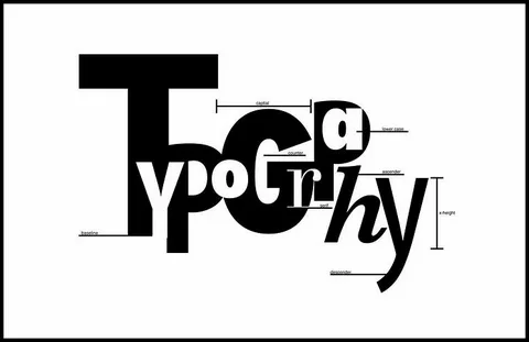
Typography is the craft of organizing text to ensure it is readable, visually appealing, and easy to understand. It covers alignment, spacing, point sizes, and typeface selection. Effective typographic design improves communication by directing the reader’s eye and affecting how information is processed, whether it is on a billboard, website, or product label.
The origins of typography trace back to the invention of the printing press, which revolutionized how text was produced and shared. Over hundreds of years, it evolved from carved wooden blocks to intricate digital fonts. Modern digital typography offers limitless creative possibilities and detailed control over every aspect of text design.
If you’re passionate about learning typography and design professionally, you can explore the
Graphic Designing Course at Diston Institute to build hands-on skills.
The Role of Typography in Design
Excellent typography enhances the personality of your brand. It encourages people to interact and makes content easy to read. Consider well-known companies like Apple or Coca-Cola. Their font selections immediately convey their personality, whether it is playful, stylish, reliable, or inventive.

Typography affects feelings and perceptions in addition to being aesthetically pleasing. Well-designed type might give the impression that a product is high-end or that a website is pleasant. It’s a technique to establish a stronger connection with your audience.
Core Elements of Typography
Understanding the core parts of type helps you craft better designs:
- Typeface: refers to the overall visual style of text, such as serif, sans-serif, script, or decorative designs.
- Font: refers to a particular weight, size, and style within a typeface family—such as Arial Bold or Times New Roman Italic.
- Style: Italic, bold, or light versions of fonts.
Getting familiar with these helps you communicate your vision better

Types of Typography and Fonts
Serif vs. Sans Serif
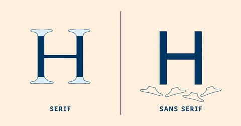
Serif fonts are characterized by small finishing strokes or flourishes at the ends of their letters. These subtle details give the text a traditional, formal look, often associated with trust and reliability. That’s why serif typefaces are frequently used in printed works like books, academic journals, and newspapers.
In contrast, sans-serif fonts have a more minimal design, without those decorative ends. Examples like Arial, Calibri, and Helvetica feel modern and straightforward. Their simplicity makes them ideal for digital screens, where clarity and readability are crucial.
Script and Display Fonts
Script fonts imitate calligraphy or handwriting. Though they can be challenging to read in big chunks, they give personality. Don’t overuse them for headlines, invitations, or logos.
Display fonts are highly stylized and designed to attract attention, making them ideal for headlines, titles, and large-format designs. They are used in branding contexts where a strong statement is required but body content is inappropriate. Make careful use of these—too many can lead to mayhem.
Modern and Variable Fonts
Modern fonts are clean and minimalist, pushing the boundaries of tradition. For a new look, they frequently combine serif and sans-serif elements.
Variable fonts represent a significant advancement. Within a single font file, they have the ability to alter weight, width, and other characteristics. For responsive web design, where you want typefaces to flow naturally across screens, this adaptability is ideal.
Principles of Effective Typography Design
Legibility and Readability
The ease with which individual letters can be distinguished is known as legibility. The ease with which a block of text can be understood is known as readability. Both are important.
A few pointers:
For headlines, use a larger font size; for the body, use a smaller one.
Maintain sufficient line space (leading) to enhance the flow.
Optimize the contrast between the background and the text.
Hierarchy and Contrast
Change the size, weight, color, or style to establish a distinct visual hierarchy. Headings ought to be more noticeable than body material.
Use contrast to draw attention to important messages. A bright red button, for instance, attracts attention more quickly than a grey one.
Consistency and Alignment
Throughout your project, use a consistent selection of fonts and styles. Regular use appears professional and fosters trust. Text can be properly aligned to the left, right, center, or justified. Your text is easier to skim when it is aligned properly.
Tools and Resources for Typography Design
Popular Typography Software and Web Tools
- Google Fonts and Adobe Fonts provide a vast collection of typefaces, ranging from free web-safe options to high-quality premium fonts.
- Typekit provides additional font hosting and licensing.
- Design software like Adobe Illustrator or Figma helps you tweak and arrange type with precision.
Resources for Choosing and Combining Fonts
Mixing fonts correctly can be tricky but rewarding. Use tools like:
- Fontjoy for pairing recommendations.
- Canva for easy pre-made font combos.
Explore blogs, books, and online courses to sharpen your skills. The more you learn, the better your type choices become.
Tips for Creating Custom Typography
Custom font design gives individuality but requires competence. Start with either digital or hand lettering. Consider hiring a type designer or making your own font with programs like FontForge or Glyphs if you know your project needs a unique touch.
Applying Typography Principles in Real-World Projects
Branding and Logo Design
One important aspect of your brand identification is the typeface used in your logo. Select typefaces that capture the essence of your company. Clean, contemporary typefaces are ideal for apps and companies.
Web Design and User Interfaces
Well-designed web typography works well on all devices. Make sure your fonts scale properly by using responsive approaches. Put readability first by staying away from clutter and extremely complicated fonts, especially on small displays.
Print and Campaigns
Print typography encounters a variety of difficulties, such as paper quality and ink bleed. To guarantee clarity, use fonts with a high contrast and sufficient size. In order to smoothly lead readers through the content, campaigns frequently combine headlines, subheadings, and body copy.
Final Thoughts
It takes both art and science to master typography. It requires a grasp of the basics, careful font selection, and the application of fundamental design principles.
Good typography enhances your message whether you’re making a print advertisement, a website, or a logo. Continue to try new things, keep up with emerging trends, and never stop learning.
Simple words can be transformed into unforgettable images with effective typography, which can affect perception and strengthen your audience’s bond. Make an investment in your education, practice frequently, and observe how your designs become distinctive.
FAQs
What is typography?
Typography is the art and technique of arranging type to make written language legible, readable, and visually appealing. It involves selecting typefaces, adjusting spacing, and styling text to enhance communication.
Why is typography important in design?
Typography influences how people perceive and interact with content. Good typography improves readability, guides the viewer’s eye, builds visual hierarchy, and strengthens brand identity.
When should I use display fonts?
Display fonts are designed for attention-grabbing titles and headlines. They’re best used in large sizes and limited to short text to maintain readability.
Where can I learn more about typography?
You can start by enrolling in a professional course.
Check out the Graphic Designing Course at Diston Institute to build your typography and design skills from the ground up.